Spot
A mobile parking concept designed to make finding, comparing, and reserving a space feel clearer and more predictable.
Spot
A smarter way
to find parking.
The challenge.
Finding parking in a busy city can mean circling blocks, unclear availability, inconsistent payment options, and uncertainty about the walk to a destination.
How might we help drivers locate parking faster and with confidence?
Research shaped the priorities.
I used driver interviews, a screening survey, and prototype usability testing to understand parking behavior. Participants included commuters, visitors, entrepreneurs, and people with mobility or caregiving needs.
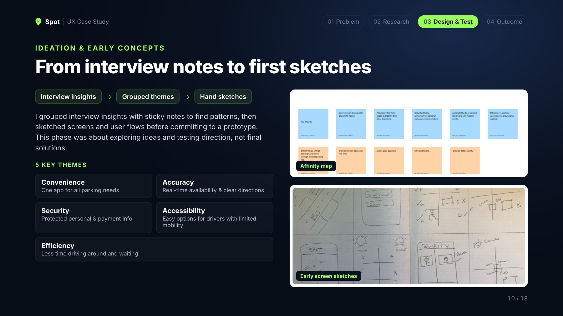
Affinity mapping surfaced five themes: convenience, security, efficiency, accuracy, and accessibility. Those themes guided the early sketches and the proposed search, pricing, and navigation experience.
Round one: make the basics clear.
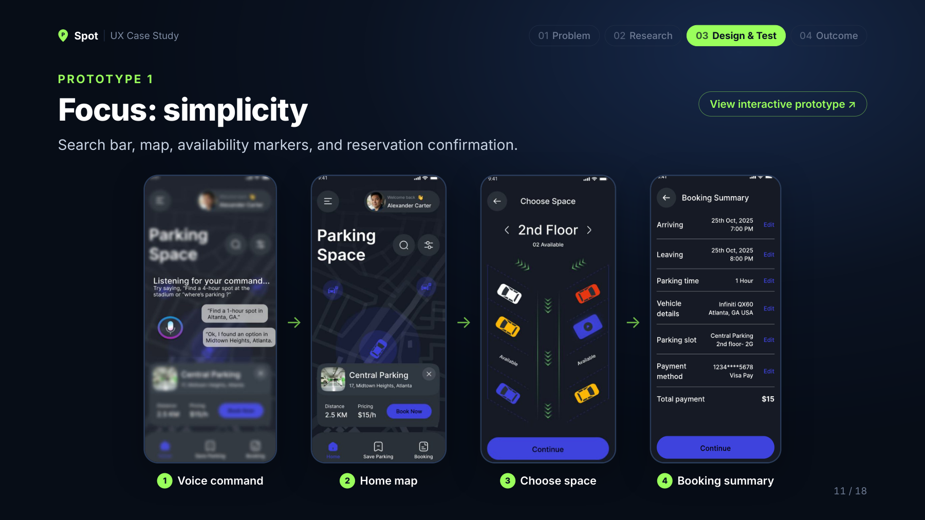
The first prototype focused on a search bar, map, availability markers, and booking confirmation. Participants appreciated the simple layout, but wanted pricing earlier in the journey and a connection to navigation tools they already trusted.
Round two: turn feedback into decisions.
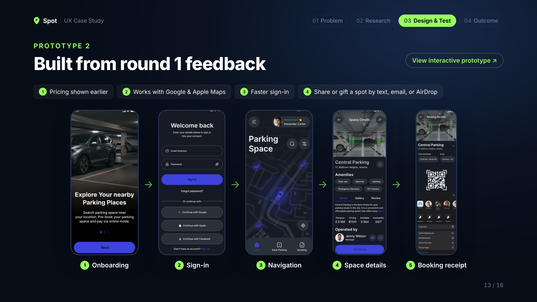
- Pricing sooner: surface cost and availability earlier to support comparison.
- Navigation: design a handoff to Google Maps and Apple Maps.
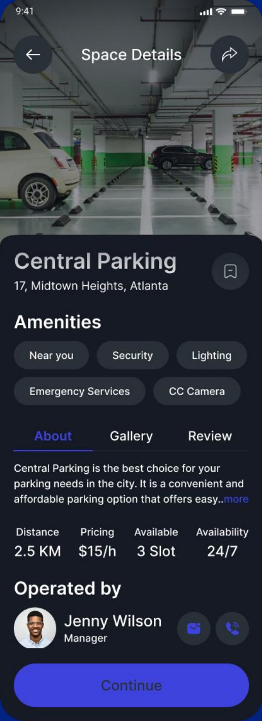
- Safety: make lighting, location, and space details easier to assess.
- Sharing: explore sharing or gifting parking details through text, email, or AirDrop.
- Less friction: simplify sign-in and keep the interface focused.
The intended experience.
Spot brings together availability, upfront pricing, map and list views, navigation, and reservation confirmation in one mobile experience.
What comes next.
Next steps include improving GPS accuracy, exploring filters for price, distance, and lighting, and expanding testing to 15 users. Longer-term plans include research with parking operators and city departments, operator tools, real-time data partnerships, and a potential Tampa or Orlando pilot.
What I learned.
Early testing shaped the major design decisions. Parking is an emotional experience as well as a practical task, so clarity, confidence, and simplicity matter. Showing the price sooner can change how confidently someone moves through the entire flow.