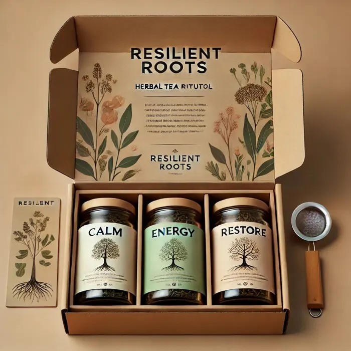
Herbal Tea Ritual
- Loose-leaf Calm, Energy, Restore
- Bamboo strainer, ceramic scoop
- Steeping ritual on inner flaps
FORThe nurse coming off nights
Brand case study · Portfolio
A veteran-founded care-package brand for deployed service members, people living far from home, teachers, nurses and first responders. Built from a blank page with AI as a creative partner.
The problem
Some jobs ask people to keep giving long after they're empty: a deployment eight time zones away, a classroom of thirty, a twelve-hour shift on a hospital floor. The people who love them want to help, but most gift boxes are generic, and nothing in them says I see what you're carrying.
I set out to design a brand that closes that gap: care packages built around real moments of strain and transition, and built by someone who has served. The question that drove every decision was simple. How can a self-care brand serve those who serve others?
Strategy
“For those facing change, stress, or burnout, Resilient Roots is a veteran-owned care brand offering grounded self-care boxes. Unlike generic gift boxes, ours grow with you through every season of life.”
Mission
Thoughtfully curated boxes that restore balance and build emotional resilience, especially for those who serve or support others.
Value proposition
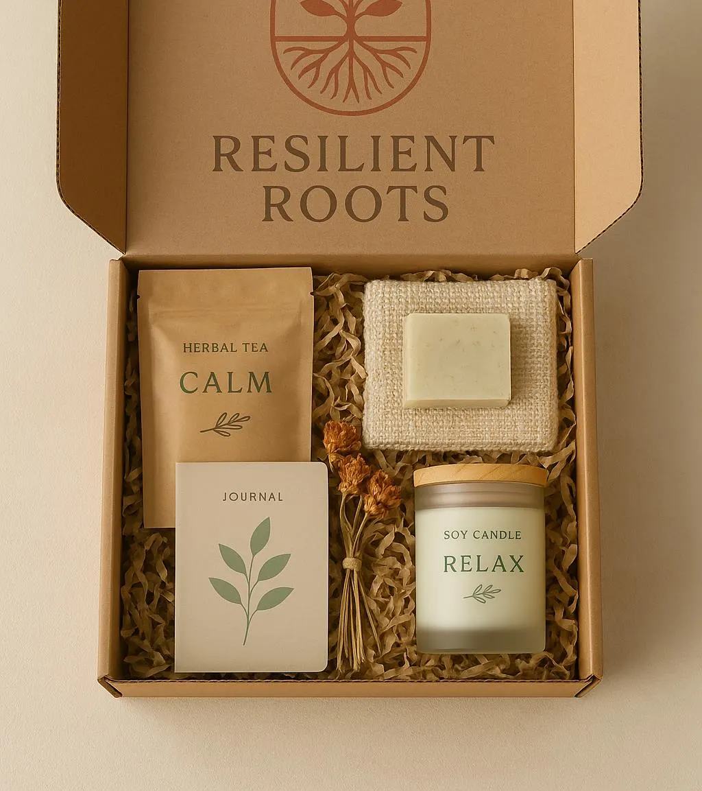
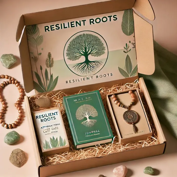
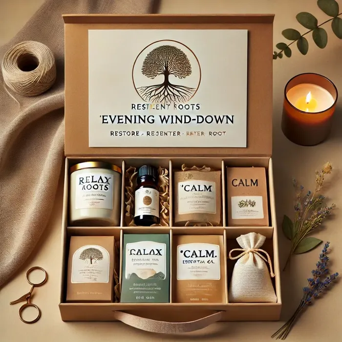
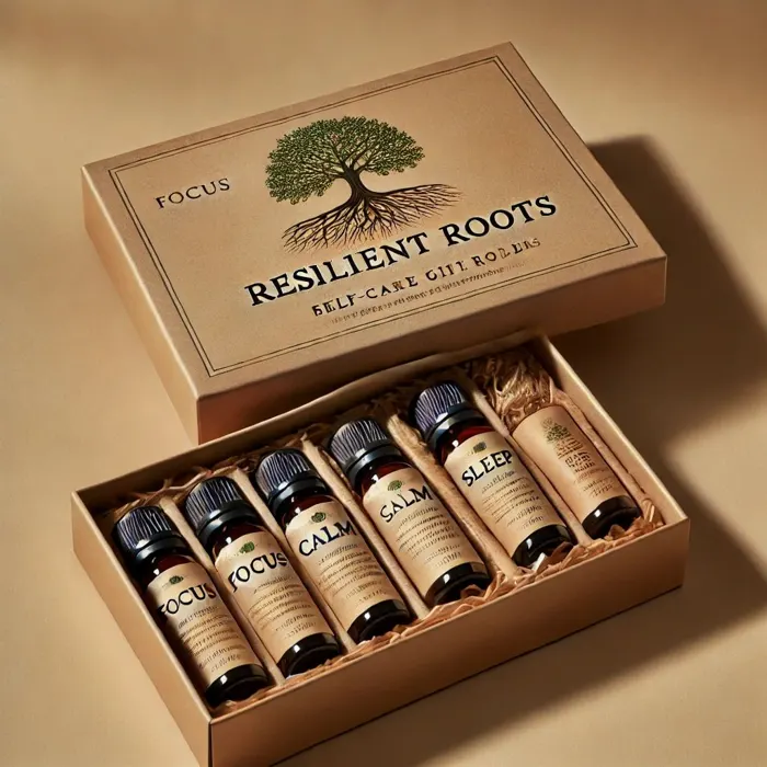
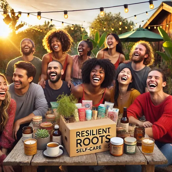
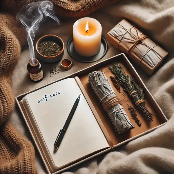
Every box is built around a ritual (tea, scent, journaling, rest) and a specific moment, rather than a random assortment of products.
Voice
Warm and reflective, never saccharine. It speaks the way a friend who has been there would.
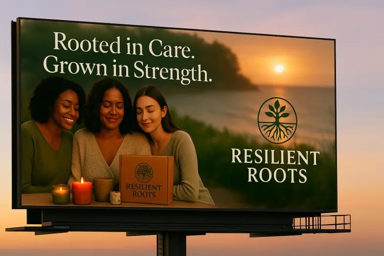
Campaign objective (creative brief): grow brand awareness 30% over Q3 through storytelling content, digital campaigns and partnerships, making Resilient Roots the go-to source for meaningful care gifting. Audience: ages 25–55, value-driven buyers who are often going through a transition themselves.
Naming
I prompted an LLM with themes of strength, calm and rootedness, then filtered the results for memorability, emotional resonance, tone, uniqueness and domain availability. The top seven went to five people from the target audience, including veterans, wellness buyers and gift givers.
Resilient Roots
Growth through adversity. Testers found it strong and soft at once, fitting for a veteran-owned brand, and not trend-bound.
“Resilient Roots feels strong and healing at the same time.”
“I can see this on a wellness box or a journal.”
“It speaks to growth and inner strength, perfect for a veteran-owned brand.”
Logo
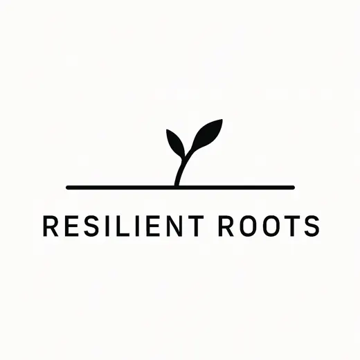
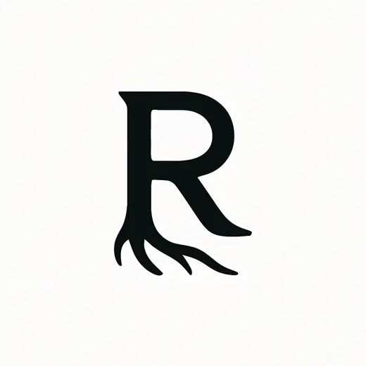
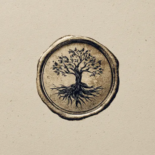
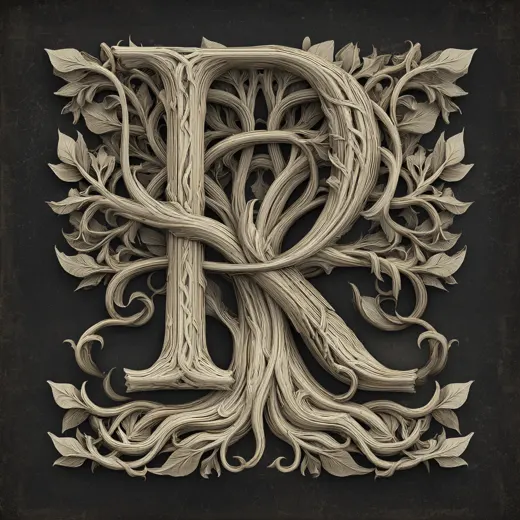
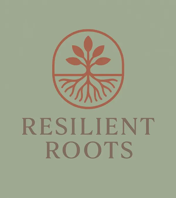
I generated and reviewed dozens of AI concepts (monograms, sprouts, wax seals, roots shaped like a heart), then narrowed toward the idea that carried the whole story: a tree whose roots are as visible as its branches.


The brand's power isn't only endurance. It's grounding. Showing the roots makes the unseen work visible, which is exactly what the care package does for someone whose hardest work goes unseen.
The circular frame reads as a seal or stamp, so it works on a lid, a hang tag, an embroidered pouch or a wax sticker.
Visual identity
Headlines
Playfair Display
Serif for strength and trust.
Body
Lato
Clean sans-serif for warmth and clarity.
Packaging
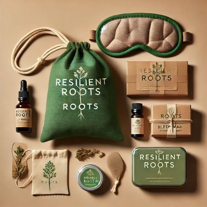
Kraft & twine
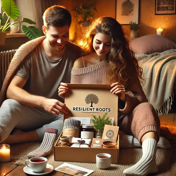
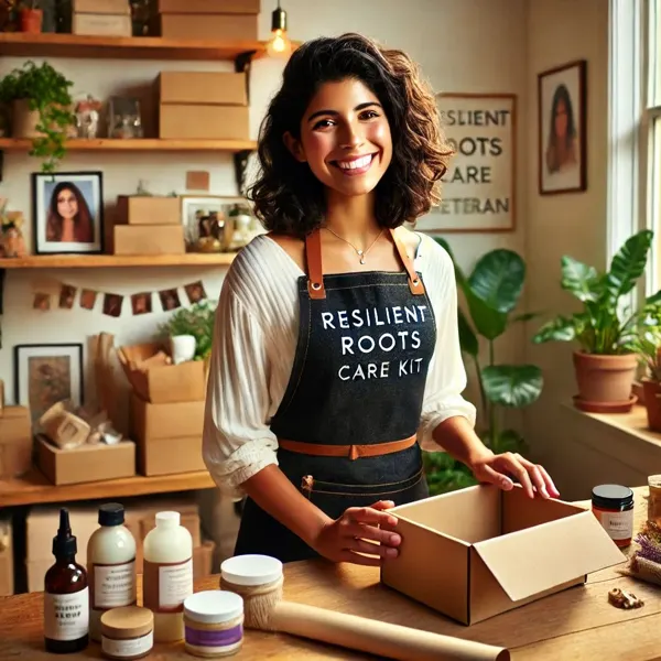
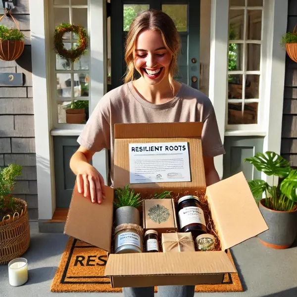
Recyclable kraft boxes, natural wraps, dried florals, handwritten notes.
The product
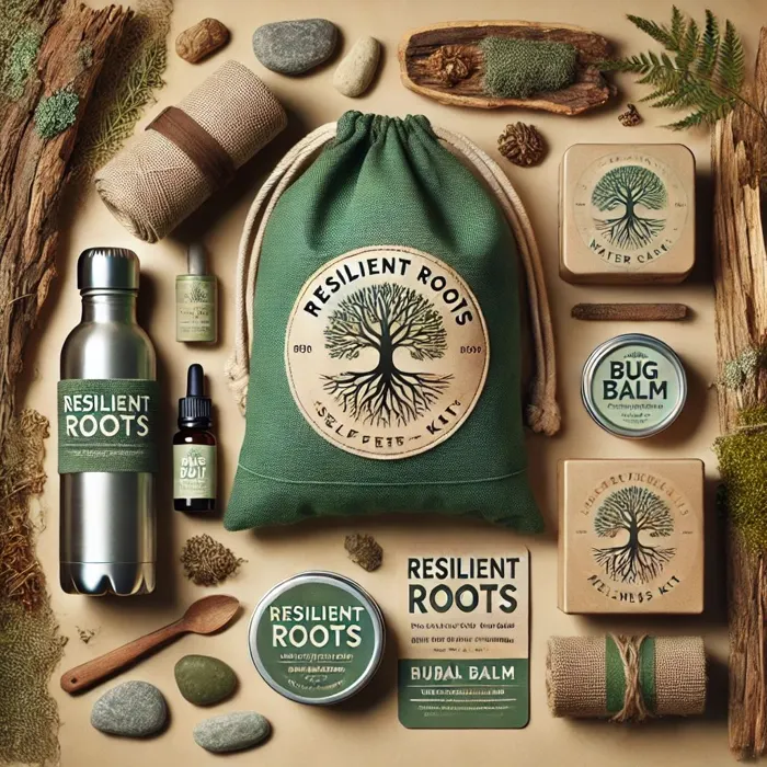
A modular system rather than one box: a recipient on a flight line needs something different from a teacher in May. Each kit pairs a ritual with packaging that feels hand-packed.

FORThe nurse coming off nights

FORDeployment and long-haul travel

FORSomeone far from home

FORThe teacher at end of term

FORFirst responders on call

FORGetting outside after a hard stretch
Bringing it to market
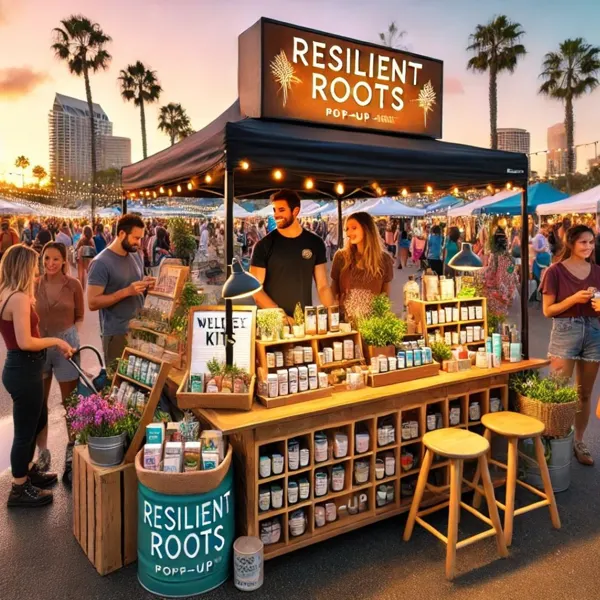
The rollout plan starts digital (DTC site, Etsy, Instagram and TikTok, email) and grows into partnerships with veteran-focused brands, pop-ups and military base events.
@resilientroots
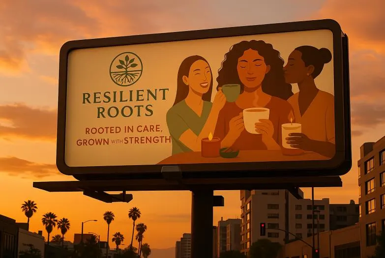
Curated self-care kits for calm, healing and strength. Latina & veteran-owned.


The grid alternates three human needs (reset, comfort, connection) so the feed has a rhythm and every post has a reason to stop the scroll.
One visual language across the set: earth tones, real faces, and headlines that invite a pause.
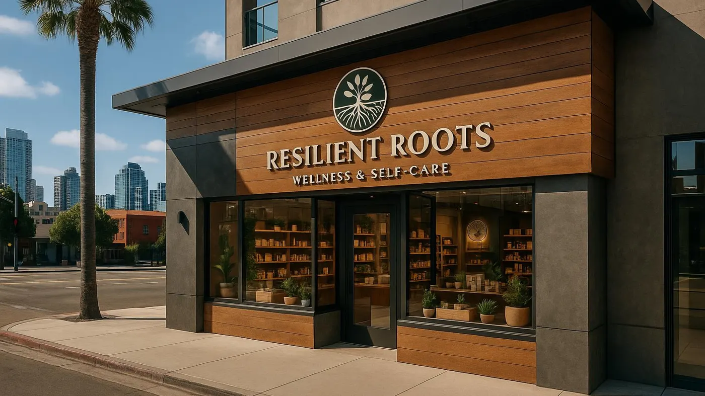
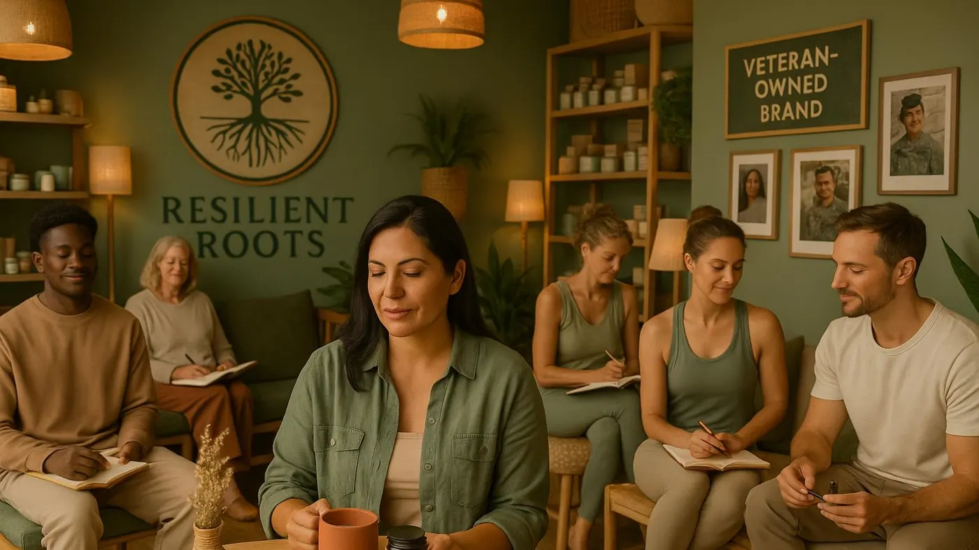
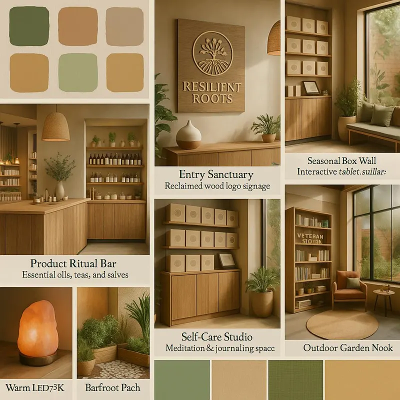
A city with a large military presence and a strong wellness culture. The store is part retail, part sanctuary: a ritual bar, a seasonal box wall, and a community room for veteran and military-family events.
Iteration
After the first round of work, the identity still read as a general wellness shop. The rebrand refocused everything on what the brand is really for.
Before
Seasonal, mood-based gift boxes for anyone seeking calm. Pleasant, but not distinct from other boxes on the shelf.
After
Kits designed around life's transitions (deployments, relocations, recovery, burnout), with deeper storytelling, cultural pride, ethical sourcing and a voice that is empathetic and inclusive.
How I worked with AI
Generative tools let one person explore at the breadth of a small studio. The decisions stayed human: every direction was filtered against the audience and tested with real people.
15 names, 10+ logo directions, packaging and store mock-ups, campaign imagery.
Resonance, memorability, tone, uniqueness, domain availability, fit with a veteran founder.
Five target-audience testers picked the name; their language shaped the brand voice.
Merged the winners into one palette, type system and packaging language across every touchpoint.
What I learned
Resilience isn't just about endurance. It's about the rituals that restore.On the brand
Self-care isn't indulgent. For those who serve and persevere, it's essential.On the audience
Care doesn't just arrive in a box. It begins at the first click.On the experience