UX case study · VR training
A virtual-reality survival trainer that lets people practice the skills they hope never to need: fire, shelter, navigation and first aid, with nothing at stake but a restart.
Nina Buruca-Nation · 2024–2025
01Brief
Starting a fire, building a shelter, finding your way out of unfamiliar terrain, clearing an airway: people rarely get to practice these before the moment they matter. Training in person takes time, instructors, travel and real risk. I wanted to know whether VR could close that gap.
Framing question
How might we
…design immersive VR experiences that equip people with essential survival skills for diverse and unpredictable real-world scenarios?
I came to design after 22 years in the U.S. Navy as an air traffic controller, a job built on rehearsing high-stakes decisions until they're automatic. That background shaped this project from the first sketch.
“I was always taught to train how you fight.”
02Discover
I ran two rounds of research: a first round of interviews and a competitive review in 2024, then a second round of interviews and a heuristic review of professional VR training tools when I revisited the project in 2025.
Research questions
Interviews

It will definitely enhance training because there’s less risk than doing it in person. Additionally, the training would be more accessible.
One thing that could be beneficial are the hand movements. They need to be realistic and similar to what you would be doing in a real-life scenario.
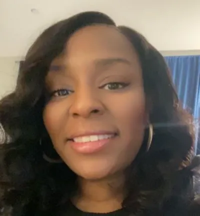
The price of these systems can create a barrier between users and the training program.
2025 follow-up interviews with Ronesha Nation (real estate broker) and Wendy Zuñiga (executive manager) echoed the first round: “Training feels safer in VR because there’s less real-world risk.”
Competitive review
In 2024 I mapped three survival games on a value-versus-effort matrix. In 2025 I added a heuristic review of two professional VR training platforms, to learn how serious training software handles guidance and errors.
| Heuristic | PIXO VR · workplace safety & first responders | ETC Simulation · disaster & incident command |
|---|---|---|
| Recognition over recall | Marketplace modules and visual menus let users browse and pick scenarios without memorizing them. | Visual libraries, templates and scenario icons help users recognize functions quickly. |
| Aesthetic & minimalist design | Clear, functional interface keeps focus on the training content. | Realism over minimalism: utilitarian screens with many instructor controls. |
| Help & documentation | Strong onboarding, guides and compliance resources for trainers and learners. | Instructor tools, training support and detailed documentation for complex scenarios. |
| Flexibility & efficiency | Customizable modules fit different industries and skill levels. | Instructors customize environments, variables and events; can overwhelm new users. |
| Error recovery | Immediate, actionable feedback turns mistakes into learning. | Real-time feedback and replay show what went wrong and why. |
Closest to my concept: jungle survival with crafting, health and hunger systems.
Strong storytelling and immersion, but survival is a backdrop, not a skill being taught.
Portable and approachable; basic tools, enemies and a defense system.
All three shared the same “easy wins”: navigation, status updates, assigned tasks, guides and how-tos. Secondary research (Survivorman VR, the American Red Cross lifeguard simulator, survival instructor Creek Stewart’s TEDx talk) confirmed that realistic scenarios are what make VR training stick.
What I learned
03Define
A parent who wants her family ready for the outdoors, and a professional whose job depends on staying sharp. Designing for both kept the product from becoming either a toy or a simulator only experts could use.
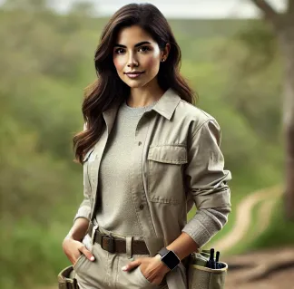
Environmental scientist
34 · Austin, TX · married, two children
“I want my kids to love and respect nature as I do, but also to know how to stay safe in it.”
Needs
Frustrations
Point of viewDiana needs flexible, self-paced, family-oriented survival training, because between family and work she has limited time to train.
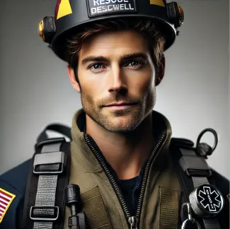
Urban search & rescue specialist
29 · Denver, CO · single
“In every disaster, there’s a moment when the right choice can save a life. My mission is to be ready for that moment, every time.”
Needs
Frustrations
Point of viewJason needs real-time collaborative VR simulations, because disaster missions involve unpredictable teamwork and practicing coordination under pressure can mean the difference between life and death.
Journey map
Bars show relative sentiment at each stage.
| Awareness | Consideration | Onboarding | Engagement | Reflection | |
|---|---|---|---|---|---|
| Diana | Sees an ad for “Family VR Survival Skills” on social media |
Reads reviews, checks affordability |
Downloads the app, sets up a family profile |
Trains with her kids in the forest level |
Shares results, feels more confident outdoors |
| Jason | Hears about advanced VR rescue training from a colleague |
Researches tech specs and realism |
Tests a demo simulation for SAR missions |
Completes a realistic mountain-rescue simulation |
Uses feedback reports to improve teamwork |
04Ideate
A crazy-eights round produced the building blocks of the game: fire, navigation, shelter, a health tracker, tools, terrain levels, multiplayer and resources.
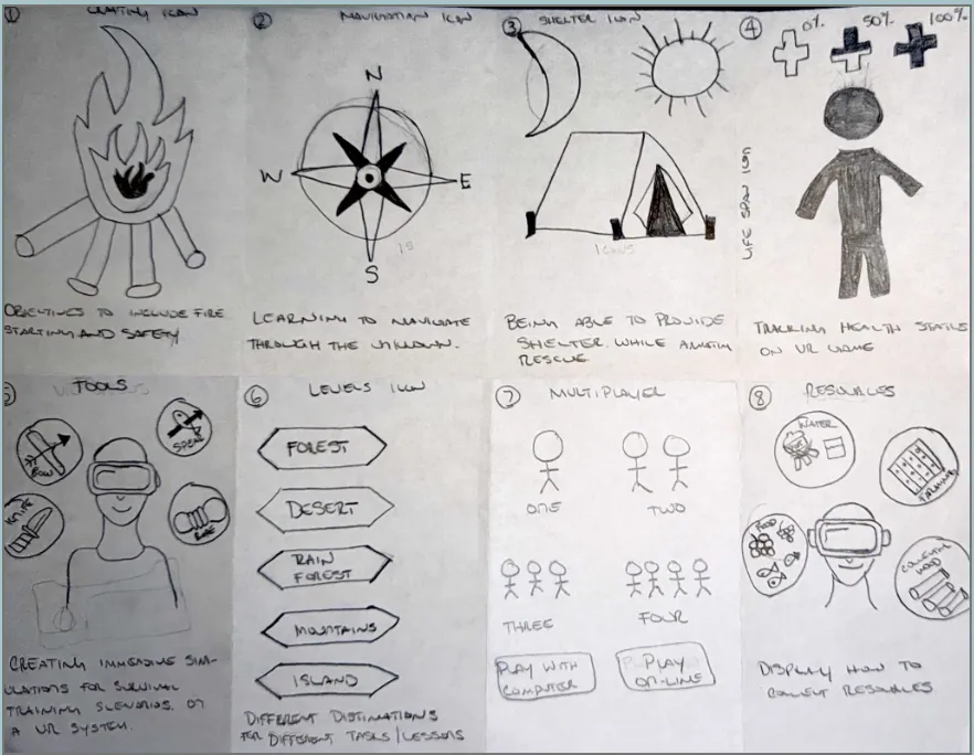
Chosen concept · sketch 8, Resources
Showing people how to gather real resources (water, food, firewood) gives the game its credibility and makes the skills feel familiar once they’re outside.
Train how you fight.
Terrain levels, easiest to hardest
Scenarios
Jason uses current rigging to set an anchor, attach the rope and check it before climbing a cliff.
Outcome: he sets the anchor correctly and climbs safely.
A friend is choking. Jason assesses the situation and starts CPR.
Outcome: he clears the airway and keeps going until breathing returns.
Jason uses his compass and map to navigate back to safety.
Outcome: he reaches camp in time, proving his navigation skills.
Task flows
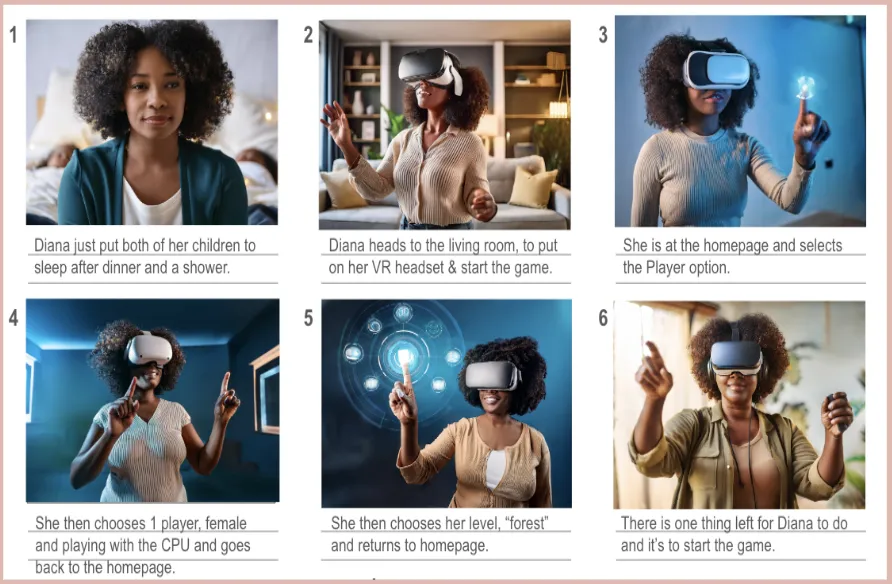
Storyboard
05Prototype
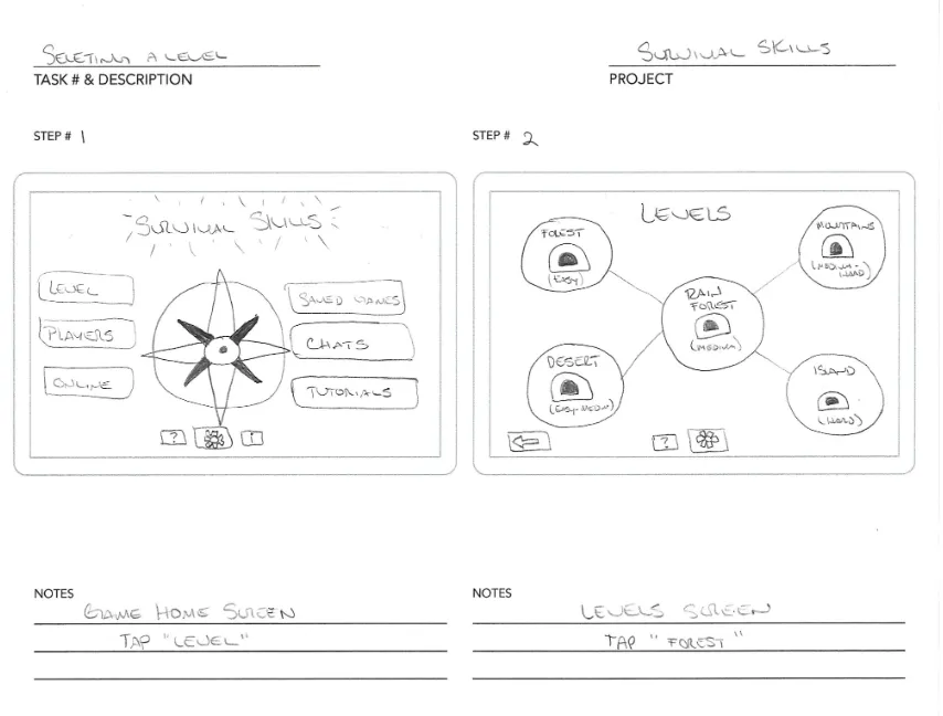
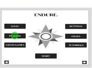
I sketched the home and level screens, rebuilt them as greyscale wireframes for testing, then applied a visual identity drawn from a sunset over a mountain lake.
Paper prototype testers
Three participants walked through Diana’s flow on the paper prototype.
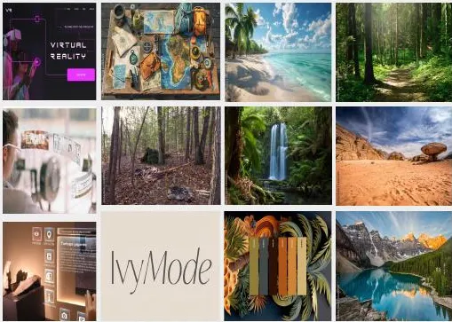
Mood & palette
Clickable prototype · 2024 · 0:24
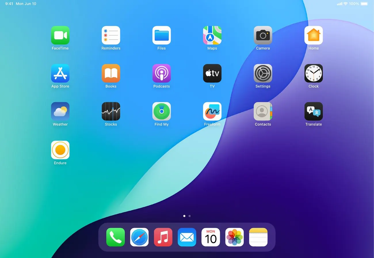
From the headset home screen into Endure, then Players (one player, female, CPU), Levels (Forest) and back home to Start.
06Refine · 2025
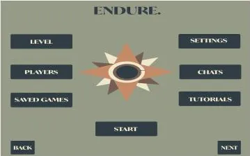
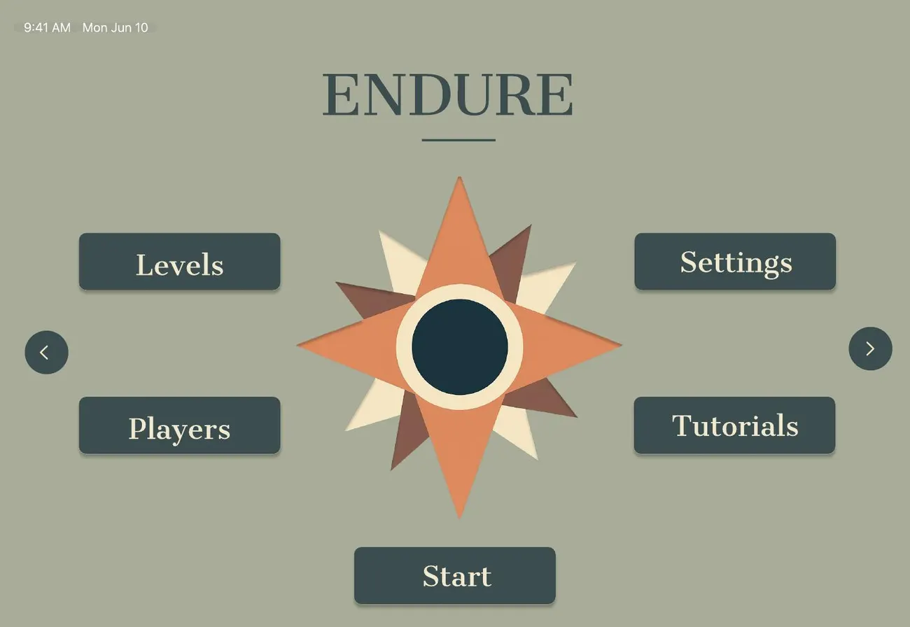
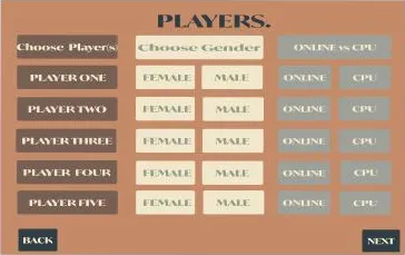
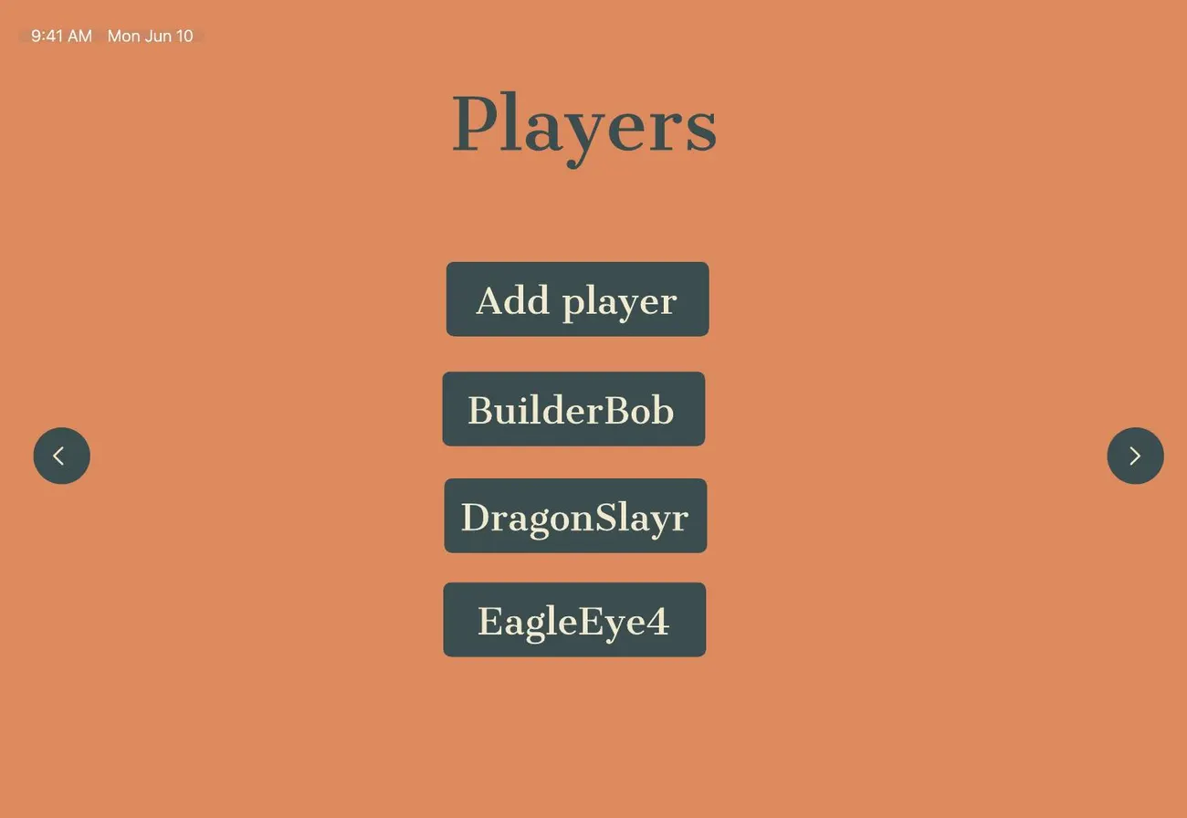
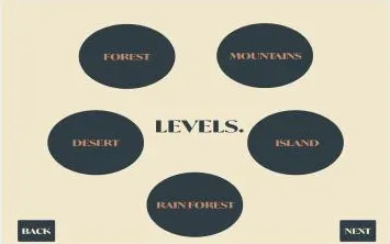
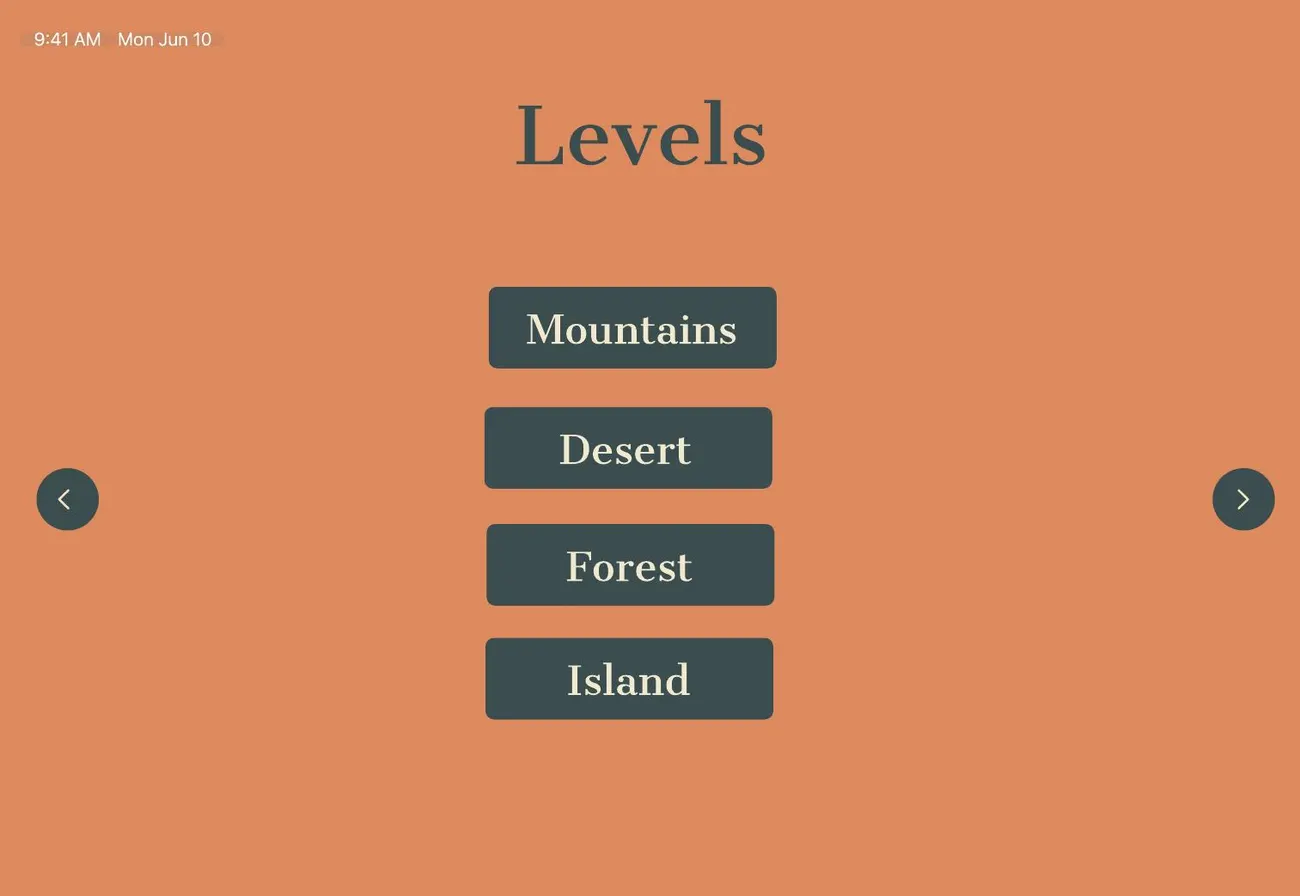
I came back to Endure with a second round of research and rebuilt the high-fidelity screens. The goal was a menu that is calmer, more readable in a headset and faster to get through.
2024
2025
2024
2025
2024
2025
Getting in
Components
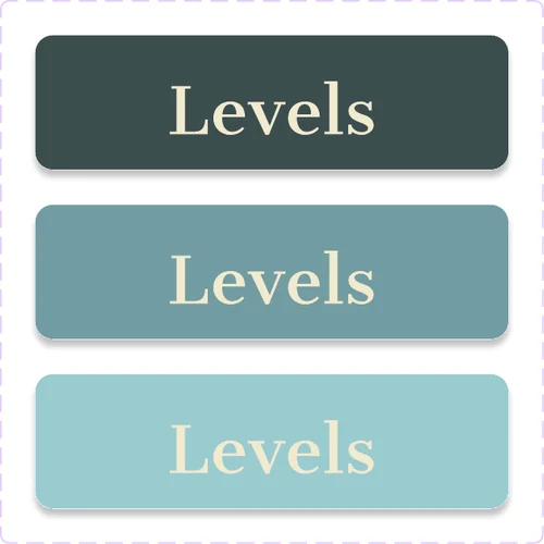
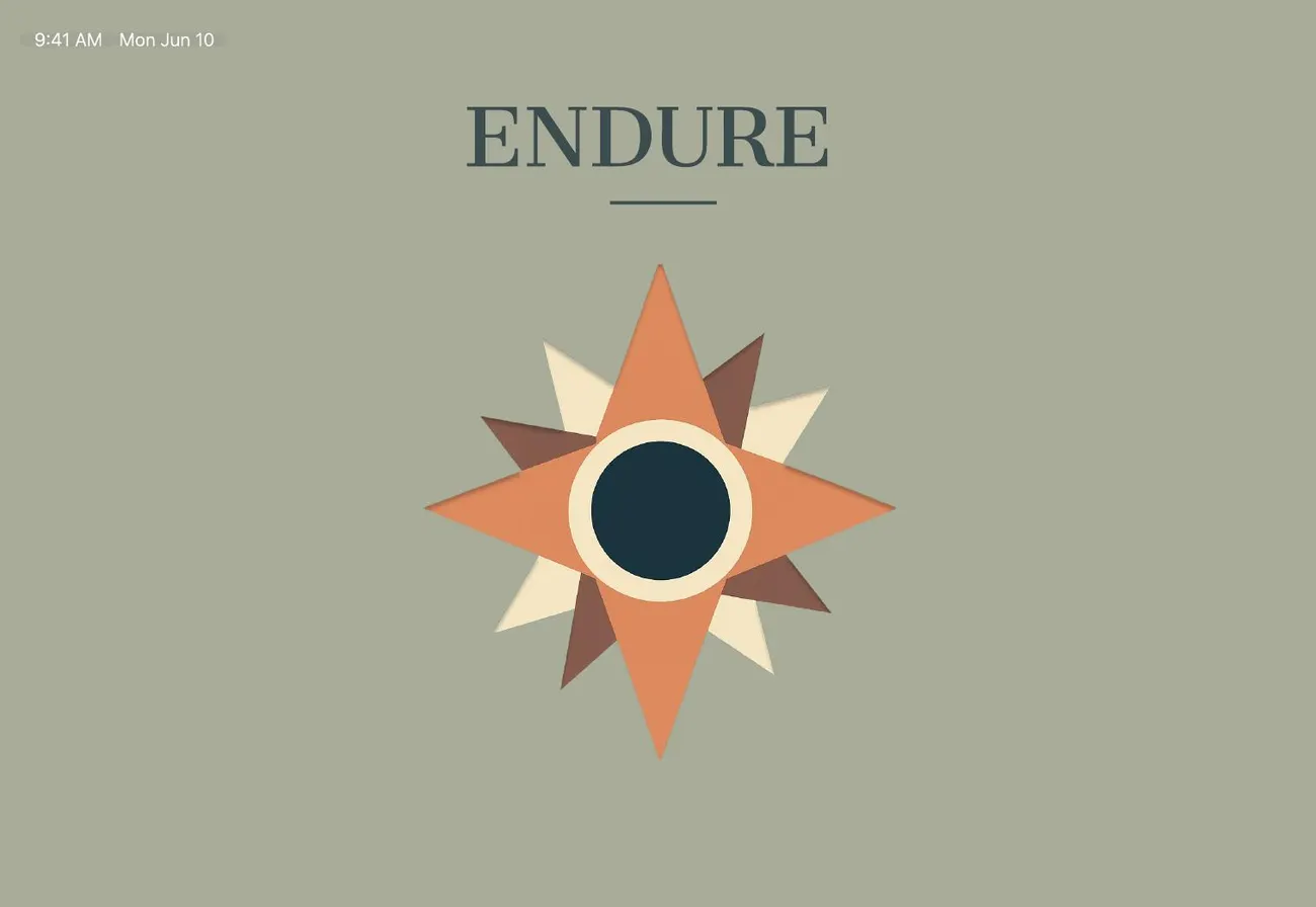
Every button ships in three tints of one hue, so interaction states read clearly without adding new colors. The 2025 palette pulls the slate, terracotta and cream straight from the compass-rose logo.
07Reflect
This project taught me how to turn research into a concept that balances clarity, meaning and visual harmony. The biggest lesson came from the redesign: every option I removed brought people closer to the thing they came to do.
Colors and shapes carry a lot of emotional weight. The compass rose became the whole identity, from the app icon to the button palette, because it says “find your way” before anyone reads a word.
Next steps